In the past and today
Hurray to the table layout!
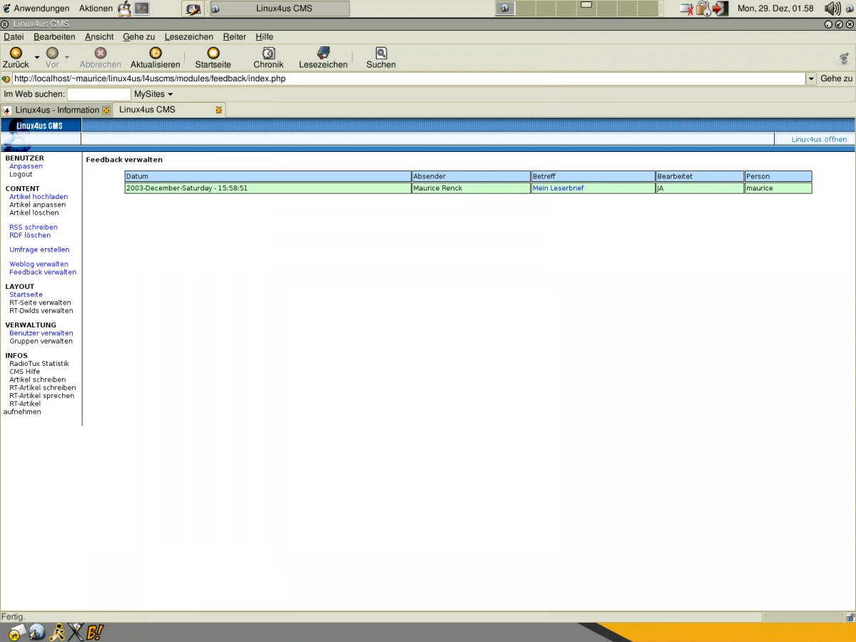
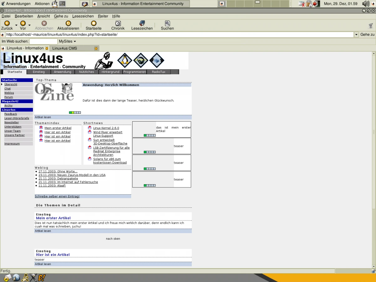
While cleaning up and reorganizing old data, I stumbled upon a few screenshots of my old website. Back then, I had a Linux news site - today, one would probably call it a blog. At that time, I still used my own CMS, and if I look at these screens, it was likely with a classic table-based layout.


I'm not even sure what the state of the website was back then, but if I take a look at the Web Archive, the structure of the page looks different. But who knows what I was working on locally at the time. Anyway, I spent a lot of time tweaking my CMS back then.
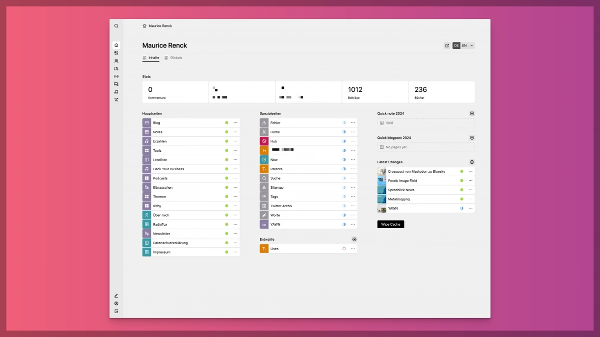
To be honest, not much has changed. I don't have my own CMS anymore, but I still tinker with my website and especially my Kirby plugins. And this is how it looks today:

I still like to try out new things and love to repurpose functions and services, but the time for that has become much less (and my frustration threshold has shifted significantly over the years).
I'm actually quite grateful that Kirby takes a lot of work off my hands compared to back then. Do you have any old screenshots lying around? Please post them!