Less is more
When you can't find functions in your own code and have to spend a lot of time searching, overengineering might be the reason. I've done a massive cleanup of my site.

While we were working on my colleague Mark's website, my fingers were itching. When working on Mark's website we always used plugins, snippets and parts of my templates - we don't always have to reinvent the wheel. And in the course of the work I noticed two things:
- I had to think far too often where to find which part of the source code
- I have too many small exceptions that don't make a big difference.
At some point I had the great idea, to build my site as modular as possible. I exhausted everything I could and ultimately ended up with a construct that was far too complex for what was actually a fairly simple website. Time to get rid of the baggage!
Getting an overview
My plan to make everything as modular and reusable as possible ultimately resulted in a number of files, all of which do a little something and in the end I kept jumping from file to file to understand processes. Not good at all.
I especially went crazy with the snippets; there were two categories:
- Organisms - snippets that were a little more complex. For example, a
Card, which consisted of several other snippets, such as thecard-footer,card-body,card-header... and the so-called - Partials - snippets that only fulfill a single task and are quite simple in themselves.
Finally, Kirby introduced the principle of slots, which is why I started with it and had some snippets that I use for layouts and that used these slots. So I had a third type of snippet. No, actually four, because there were also snippets with which I overwrote snippets from plugins...
I let zsh count, old vs. new:
- old: 82 snippets 🤯
- new: 34 snippets
- old: 25 templates
- new: 16 templates
34 snippets still a lot, ut I don't have any code here that I don't want to go without and I don't like overloaded files either, so I'd rather split them up into logical blocks.
For most of the templates there was also a controller and for a few there was also a model. In addition, there are also some page methods...
I also decided to switch from the previously used UI framework UIKit to Tailwindcss. I was pretty excited about it at first, but then it started to really annoy me.
My beautiful HTML code became more and more confusing, I kept repeating myself because I didn't want to build a component for every little UI element. So I started converting the Tailwind stuff into my own SCSS. But of course I never finished this, because there were always more important things. So now I wrote the CSS complete new.
When changing away from Tailwind, I have been working intensively with CSS and all the new possibilities again, I didn't do that for a long time and found fun in it again. I quickly realized that I no longer needed SCSS; now I can do all of this much better directly with CSS.
My build process is now limited to just packaging up individual CSS files and a hot reload when developing locally. Love it.
Reduction
It was clear from the start that I wanted to use fewer snippets etc. Those could be reduced simply by not overdoing the components. I had written two methods $site->partial() and $site->organism() with which I could load my snippets and which abstracted my folder structure. I definitely wanted to get rid of them.
One Snippet to rule them all
The first snippet I wrote was my layout snippet. I started quite simple, header, footer, main content. The original idea was to have one main layout snippet and then later use that as a basis in the different page types. A listing and the article view would then use the snippet and perhaps use layout snippets themselves.
However, I quickly came to two conclusions:
- I don't need 5 different listing types, all of which only differ in a few details.
- If I'm very strict, all templates can use the same layout snippet.
That's how I did it. I only have this one layout snippet, which contains several slots. Most of them are simply blank by default. I can then decide in the respective templates whether and how I want to use them:
<main>
    <?php snippet('page/breadcrumb') ?>

    <?php if ($intro = $slots->intro()): ?>
        <?= $intro ?>
    <?php endif; ?>

    <?php if ($body = $slots->body()): ?>
        <?= $body ?>
    <?php endif; ?>

    <?php if ($actions = $slots->actions()): ?>
        <?= $actions ?>
    <?php endif; ?>

    <?php if ($related = $slots->related()): ?>
        <?= $related ?>
    <?php endif; ?>

    <?php if ($comments = $slots->comments()): ?>
        <?= $comments ?>
    <?php endif; ?>
</main>
In most cases, these slots in the templates are simply filled with a snippet, here for example the comments in the default template:
<?php slot('comments'); ?>
<?php snippet('post/comments'); ?>
<?php endslot(); ?>
This makes my default template very slim. Because I also decided that I don't need so many slightly different listings and page templates, my code has become enormously leaner and is still not overloaded because I may try to compensate for missing templates with a number of if queries.
I was also able to reduce all of my components enormously. The card that I used on the old site existed in two different variants, each sharing 3-4 partial snippets. Those times are over. My cards are now just a snippet with slots. Thanks to container queries in CSS, they are still far more dynamic than they ever were before. So cool!
<?php snippet(
    'card',
    [
        'link' => $article->url(),
        'backgroundImage' => $article->getHeroImage(),
        'classNames' => [$className],
    ],
    slots: true
); ?>
<?php slot('preview'); ?>
<h3><?= $article->title() ?></h3>
<?php endslot(); ?>
<?php slot('details'); ?>
<p>
    <?= strip_tags($article->intro()->kirbytext()) ?>
</p>
<?php endslot(); ?>

<?php endsnippet(); ?>
So instead of loading a snippet here, which is made up of four other snippets and they all pass data to each other and blah... just a card snippet with slots ❤️
Container queries in CSS also allow me to make things like my embed box more flexible. Previously I had to enter CSS classes that set whether the preview image takes up the left, top or entire space. Thanks to Container-Query this is no longer necessary. Depending on how much space the box has, it decides where the image is best positioned:
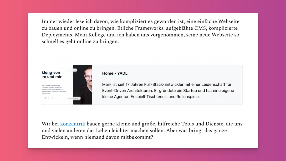

Now you could of course ask, Whatever that means, it has always been possible with media queries. The highlight, however, is that this is not based on the width of the screen, but on the space that the box has within the page. So if I insert the box into an article where it has a lot of space, the image is on the left. If I insert it into a (non-existent) sidebar where it only has a little space, the image is positioned at the top.
One controller to rule them all
I also started working on my controllers. I have a lot less of that anyway because I have a lot fewer templates. I introduced a site controller, which provides the basic data that each site needs. Any other controller, integrates this site controller first. If a template has no controller at all, Kirby automatically uses the site controller. This way I can ensure that each template always has certain data at hand.
The main controller then contains e.g. data for the meta tags, a hero image or which team the page belongs to (more on that at some point 😎). The listing controller then just enriches this data:
return function ($site, $kirby, $pages, $page) {
    $shared = $kirby->controller('site', compact('page', 'pages', 'site', 'kirby'));

    // […]

    $articleList = $page->articleList($sourceBy, $sortingBy, $sortingDirection, $limit);

    $exports = [
        'articleList' => $articleList ?? [],
    ];

    return A::merge($shared, $exports);
};
One listing to … Okay, I'll stop
Another decision was, that I want fewer different listings. Most of my listings have differed slightly in the way they are presented. Nothing that would justify so many exceptions and extra templates; I also don't think visitors really noticed the differences and if they did, they probably perceive them as inconsistent. So templates reduced, everyone uses the same controller, even exceptions rely on the site controller:
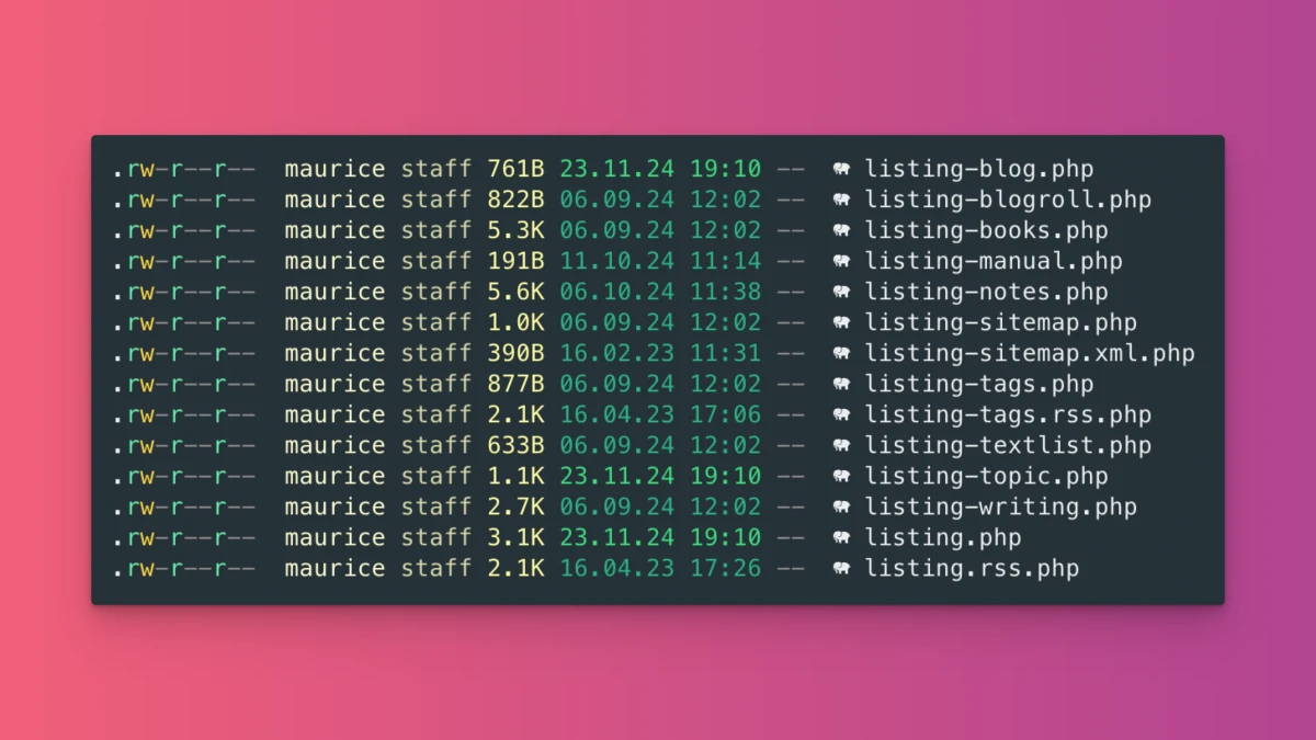
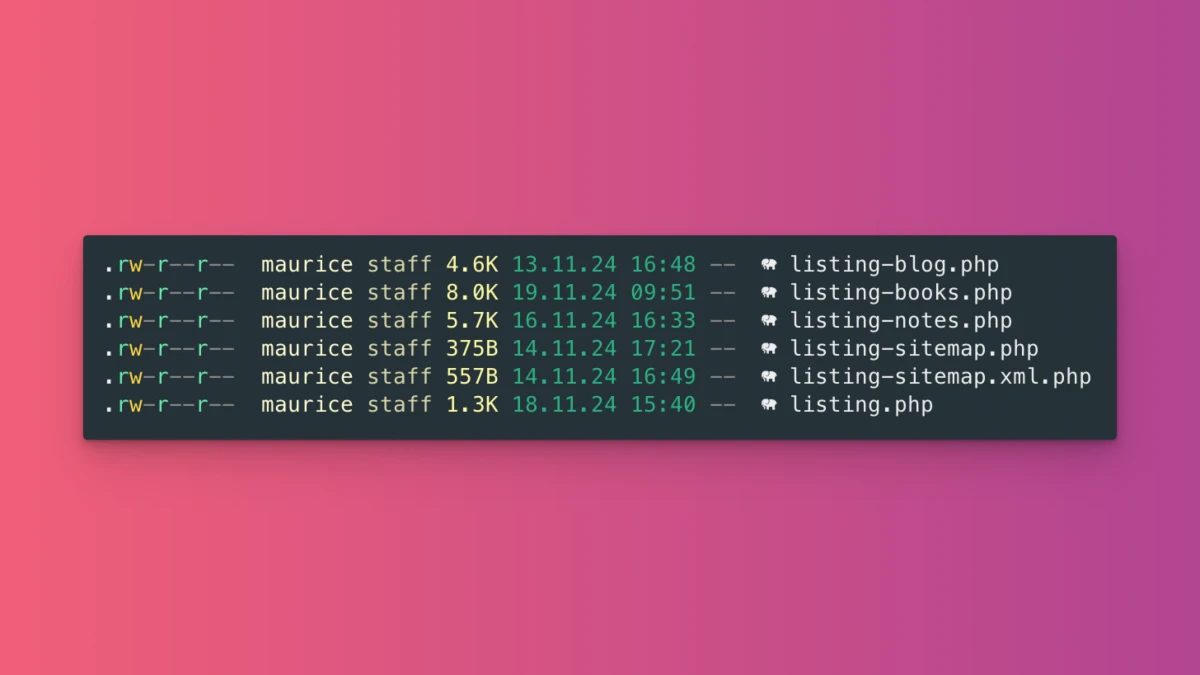
Maybe you already noticed this line of code from the sample above:
$page->articleList($sourceBy, $sortingBy, $sortingDirection, $limit);
There's quite a bit of magic happening here. I couldn't go without this page-method; I had already used it in a similar form on the old site. The code behind it ensures a dynamic listing, although the same template with the same controller is always used.
The really great thing about it: I can control the listings via the panel by selecting a source type and then select the appropriate options:
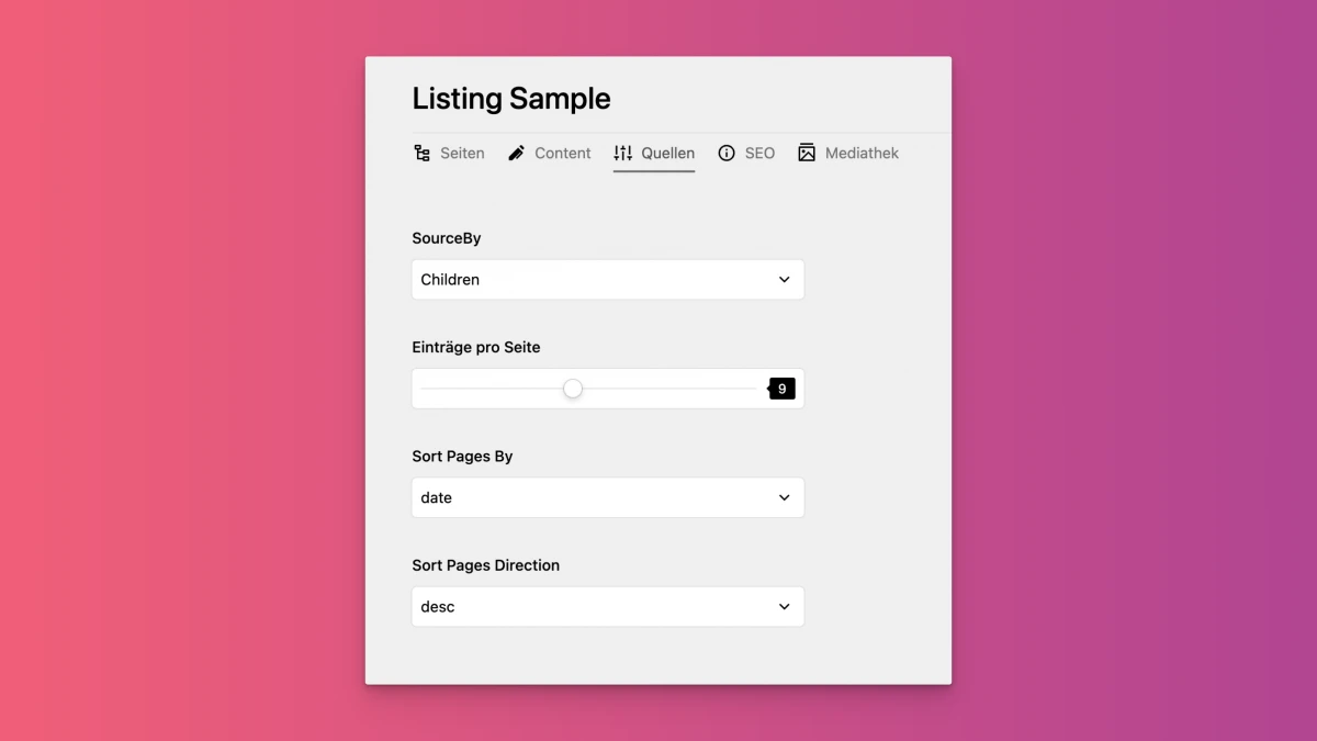
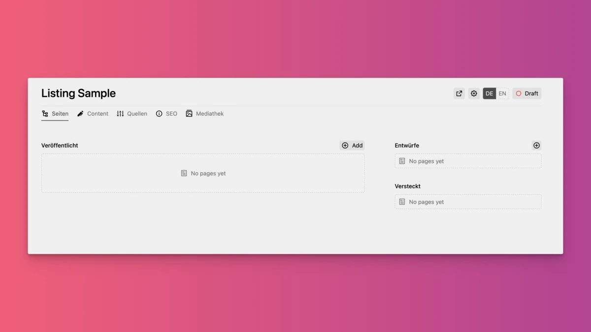
As you can see here, I can select the type of source, can say how many entries per page are displayed and when pagination begins. On top of that, I can also specify how the entries should be sorted.
If I select 'Children' or 'Index' as the source type, I have the option of creating subpages under Pages. If I select a different type of source, this is no longer the case. I then use metadata that is stored on the pages. Here are all the options:
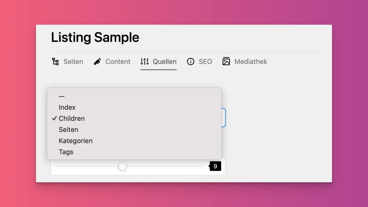
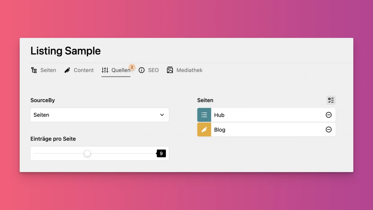
If I select the Pages type, I can make a selection of pages on the right that serve as a source:
If I select 'Categories', for example, I will see a selection of all existing categories. All pages with the respective category are then listed in the listing.
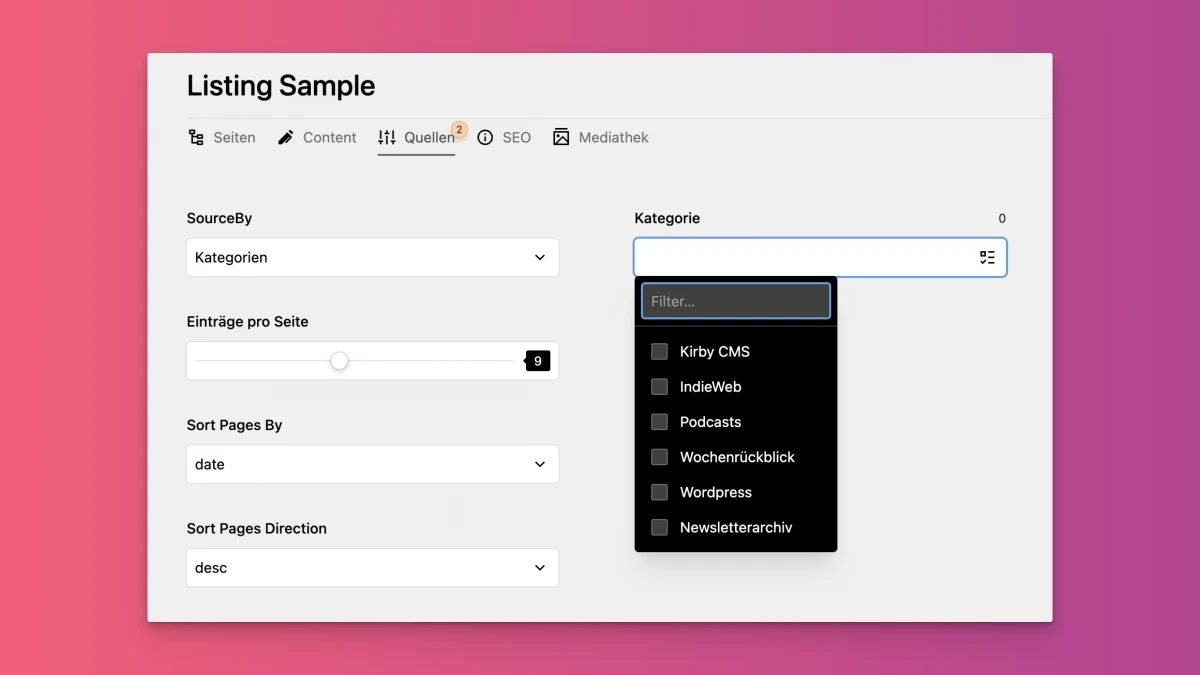
This enables me to create many different listings, all of which are based on the same template.
There are a few exceptions, the reading list for example or special pages such as the homepage, about or now. They have their own templates, but are still based on the layout.
Plugins
I was also able to throw out a few things when it came to plugins, but the list is still quite long, although the majority of the plugins are simply little helpers that I have outsourced. Of course, there are a few larger ones too:
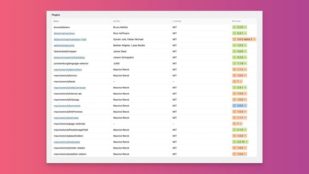
Of course, the IndieConnector and the komments plugin are particularly important to me. The Komment plugin is running with an unpublished, new major version that will soon be available to everyone. I need the Podcaster plugin for my podcasts.
The LinkPreview plugin allows me to have these little embed boxes. It goes through all the links in a page and gets and saves their metadata. It's still a bit buggy, but as soon as things get better I'll publish it.
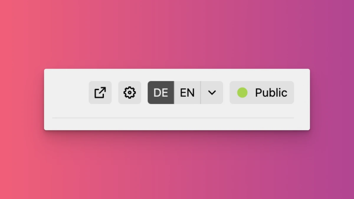
Another very important thing is the Staticache plugin, which creates static HTML files for me and thus speeds up my site. The highlighter plugin ensures that source codes are displayed well on my pages and the language selector plugin changes the layout of the language changer in the panel, which I think is a bit more practical to use this way:
Now it's important to maintain this structure and not get carried away with exceptions. I still have a few ideas for my site and the hub area in particular should work differently later, but I will try to deviate as little as possible from the current structure.
I had strange behavior with the hub because no matter which subpage of the hub I accessed, I always got a 404 error. As soon as I changed the route, no longer calling it /hub but hub-test, everything worked again. I searched .htaccess, routes and plugins and have simply found no reason for the behavior.
Especially because the same construct worked on the old site. I could only help myself by renaming the route and adding the necessary redirects...
Get rid of it
A few pages have also been removed, such as the overview page of all my articles here and elsewhere. Thanks to Umami, I was able to quickly identify which pages I had built special features for, but which were almost never accessed. The decision was then: get rid of it.
So you might get a few 404 errors, which are intentional.
In general, I don't want to rule out the possibility of errors occurring here and there because I've overlooked or forgotten something. That could certainly happen in the coming days and weeks. I'll keep an eye on this.